
Laura Hudson Architecture
Refined brand identity and digital presence for architecture firm
Refined brand identity and digital presence for architecture firm
Scope
Scope
Brand Identity / Product & Information Design / Environmental Graphics
Brand Identity / Product & Information Design / Environmental Graphics
/
Brand Identity
(01)
Refining an Established Architectural Identity
Working with the Laura Hudson Architecture team, the project focused on improving legibility and consistency across applications while preserving recognition of the existing brand.
The mark was simplified by removing secondary linework and refining color, reducing visual noise and strengthening reproduction across print and environmental uses.
Original logo concept: Jenny Fares
Identity refinement and application: Alex Minkin
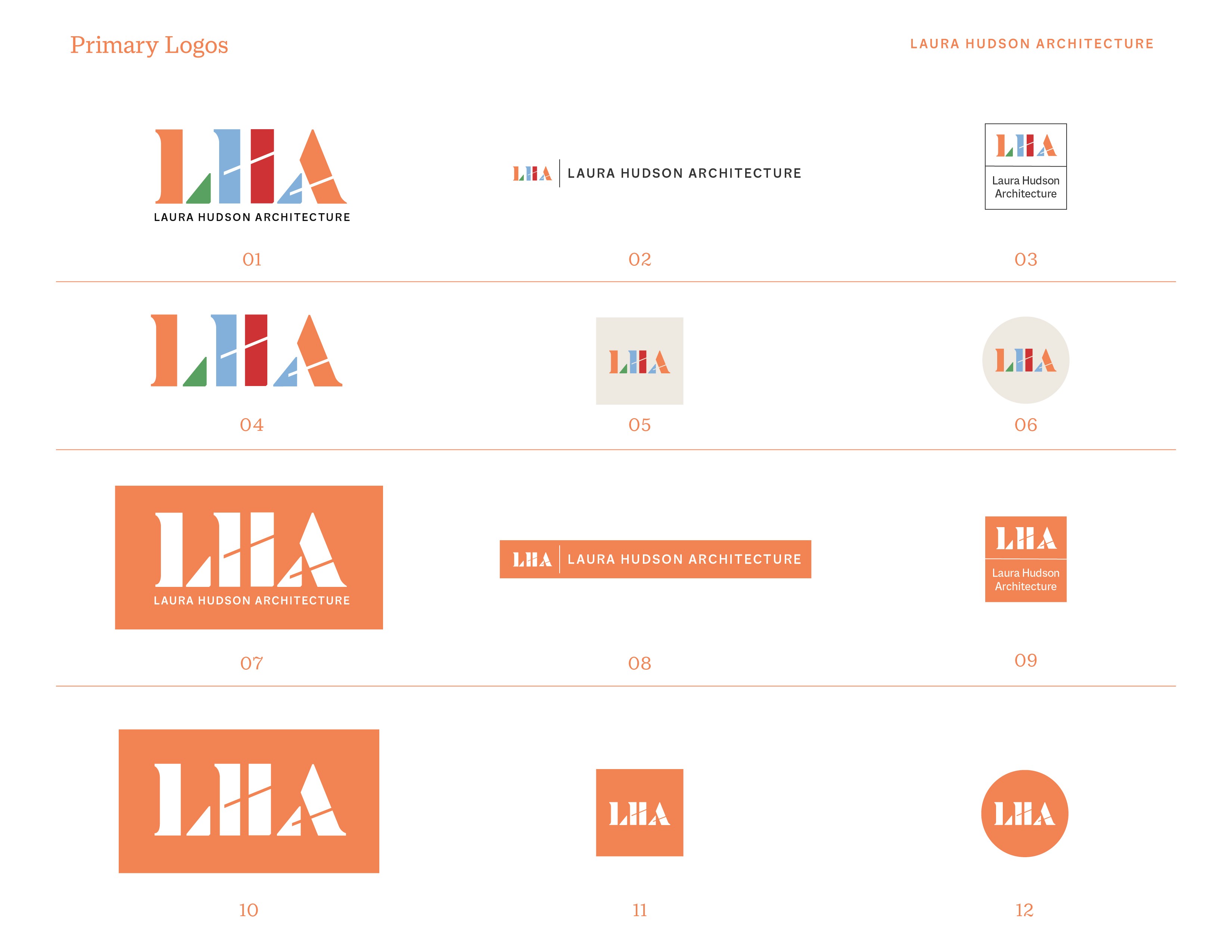
New Logo Assets
Orange Crush
Desert Storm
Seagull Blue
Fruit Salad
Rich Red
/
Brand Identity
(01)
Refining an Established Architectural Identity
Working with the Laura Hudson Architecture team, the project focused on improving legibility and consistency across applications while preserving recognition of the existing brand.
The mark was simplified by removing secondary linework and refining color, reducing visual noise and strengthening reproduction across print and environmental uses.
Original logo concept: Jenny Fares
Identity refinement and application: Alex Minkin
/
Product & Information Design / Brand Identity
(02)
Refreshing the Digital Presence with Color and Intentional Structure
Laura Hudson Architecture’s previous website presented projects cleanly but lacked hierarchy and clear navigation. Visitors could browse images, but the structure did not communicate the relationships between projects or the firm’s areas of work.
The redesign introduced a consistent page structure, project differentiation, and a defined typographic hierarchy. Background color was used as an organizational system rather than decoration, helping users orient themselves while preserving the firm’s minimal aesthetic.
↓ The old website was minimalist and elegant but also plain and not connected to the new LHA visual identity


↓ The old website was elegant and minimal, but needed a system
↓ The redesign introduced a balanced and stylized typographic hierarchy and added warmth with an off-white background.
Click image to go there!
↓ The new website solved this by using color and new type to create a cohesive system. Click image to go there!

↑ The redesign also used the new color palette to introduce a light touch of differentiation between pages
↑ The redesign also used the new color palette to introduce a light touch of differentiation between pages
/
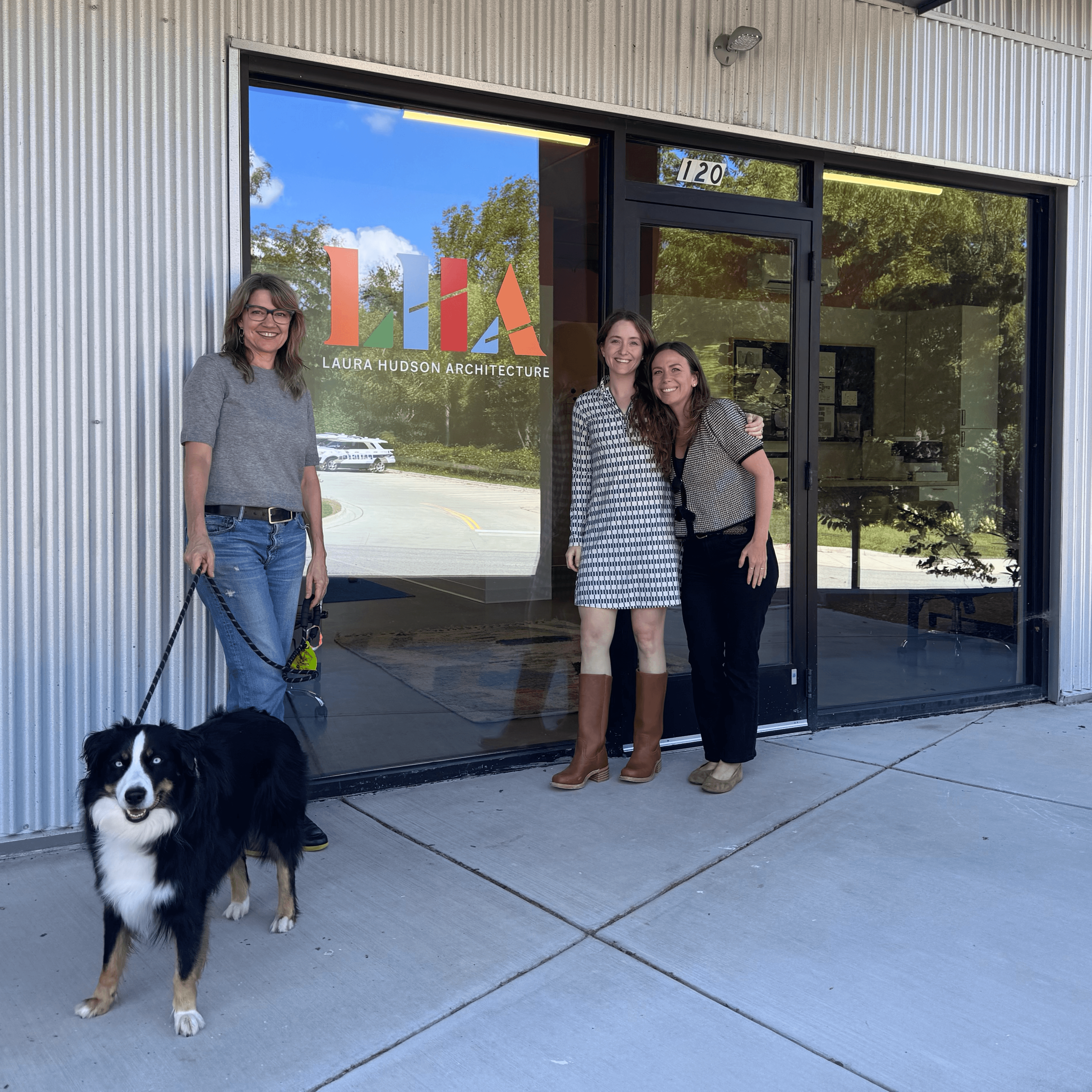
Environmental Graphics / Brand Identity
(03)
Tactile Brand Touchpoints
I designed business cards with substantial weight, embossing, and spot UV — creating a tactile experience clients could feel and remember. The brand also extended to office signage, reinforcing the firm's visual identity in their physical space and creating a cohesive presence from digital to built environment.


/
Product & Information Design / Brand Identity
(02)
Refreshing the Digital Presence with Color and Intentional Structure
Laura Hudson Architecture’s previous website presented projects cleanly but lacked hierarchy and clear navigation. Visitors could browse images, but the structure did not communicate the relationships between projects or the firm’s areas of work.
The redesign introduced a consistent page structure, project differentiation, and a defined typographic hierarchy. Background color was used as an organizational system rather than decoration, helping users orient themselves while preserving the firm’s minimal aesthetic.
↓ The old website was elegant and minimal, but needed a system
↑ The redesign also used the new color palette to introduce a light touch of differentiation between pages
↓ The new website solved this by using color and new type to create a cohesive system. Tap image of homepage to go there!
/
Print Deliverables
Environmental Graphics / Brand Identity
(03)
Extending the Brand into Physical Space
I designed business cards with substantial weight, embossing, and spot UV — creating a tactile experience clients could feel and remember. The brand also extended to office signage, reinforcing the firm's visual identity in their physical space and creating a cohesive presence from digital to built environment.
Laura Hudson Architecture
Refined brand identity and digital presence for architecture firm
Scope
/ Brand Identity
/ Product & Information Design
/ Environmental Graphics